Desirability, Viability, Feasibility
Redesign Attendance Scanner

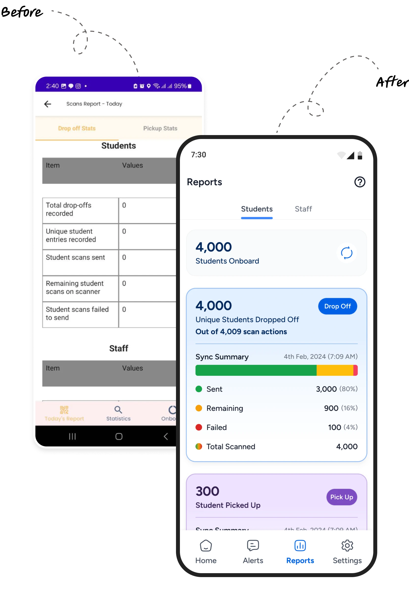
"The design doesn't look nice. It's not straightforward. It doesn't look well thought through." -
Did the app function properly? Yes, but this is a clear example of how visual design impacts user experience. Many inconsistencies and a lack of professionalism and intentionality in the design were evident.
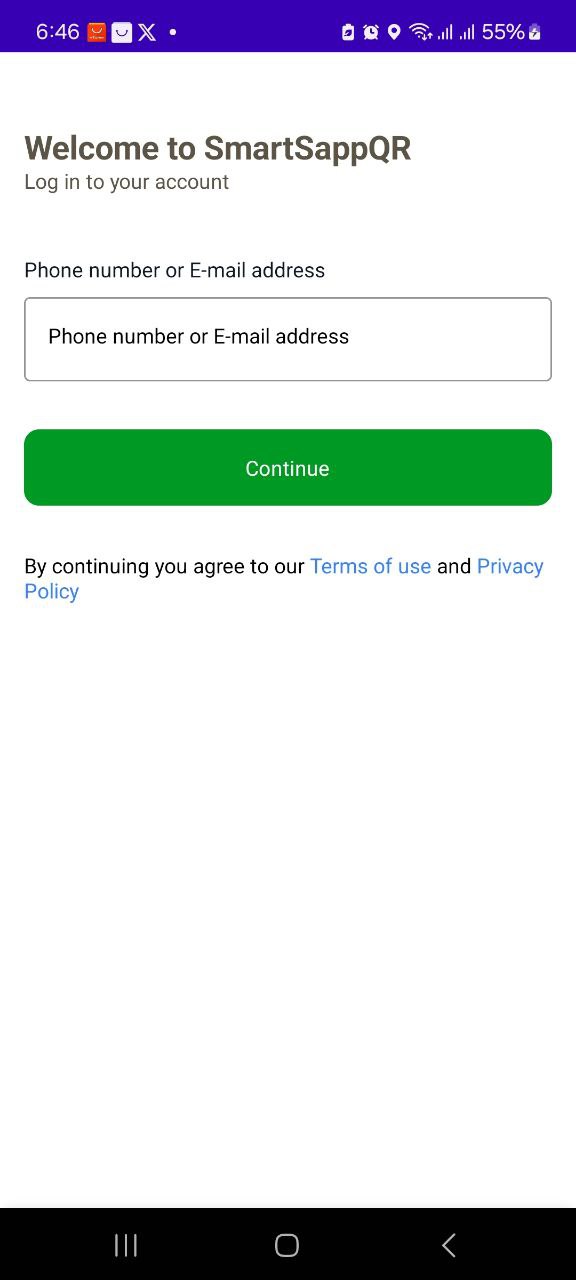
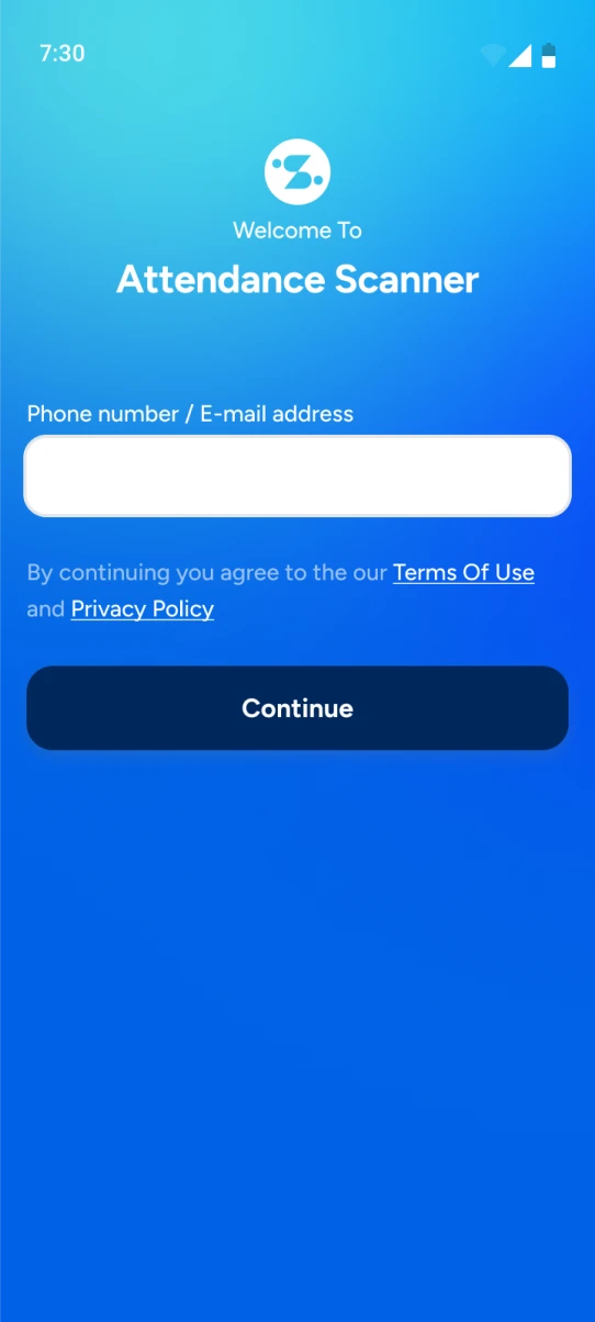
First Impression: Splash & Login Page
- Made the login page distinct to differentiate it from other apps used by the schools.
- Reflected the brand colors (blue) on the login page.
- Ensured the login page was simple and straightforward.
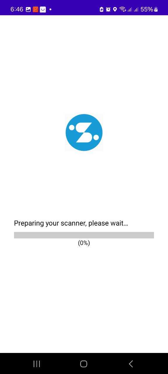
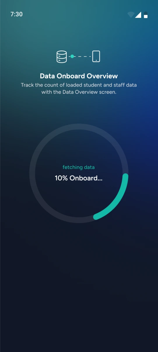
Data Download For Offline Usage
- Clearly communicating to user what's going on the page. The app works offline hence downloading data onto the app.
- Visually communicating the progress of the data being fetched onto the device.
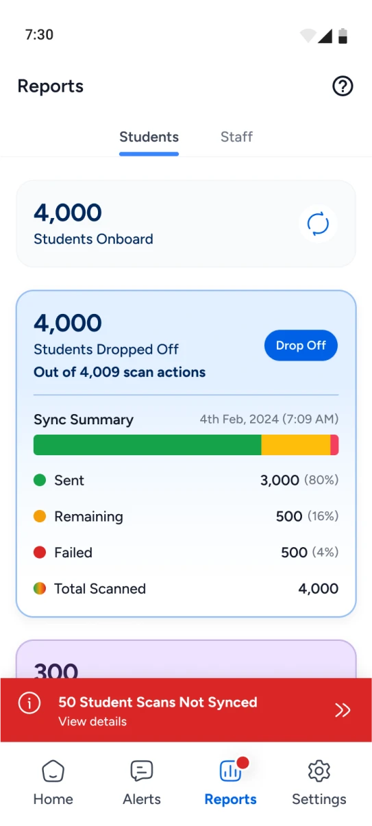
Data Onboard Summary
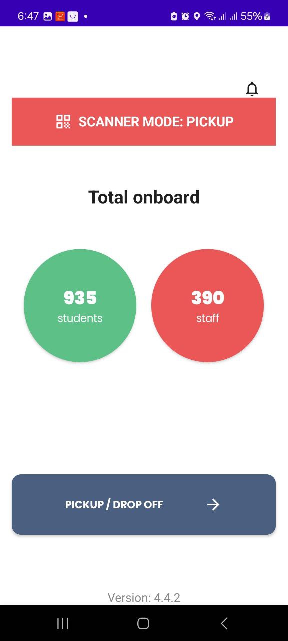
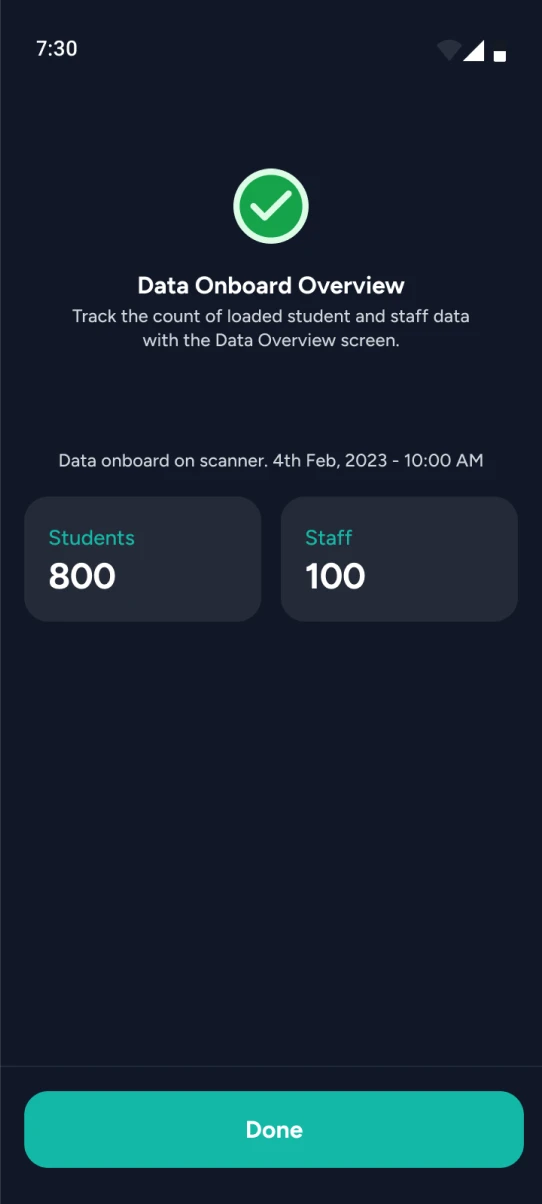
- Visually communicated the data onboarding process using a design element that doesn't resemble a button.
- Removed the scanner mode component as it was irrelevant to the user at this stage and non-interactive.
- Provided a clear call to action for the next steps.
- Removed the notification icon as it was not pertinent to this page.
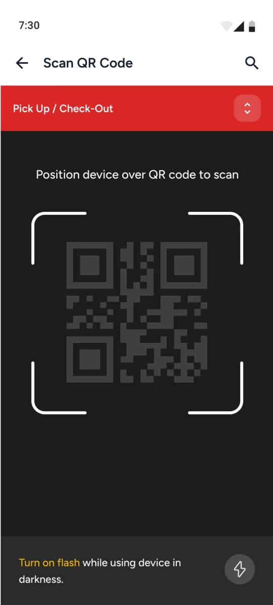
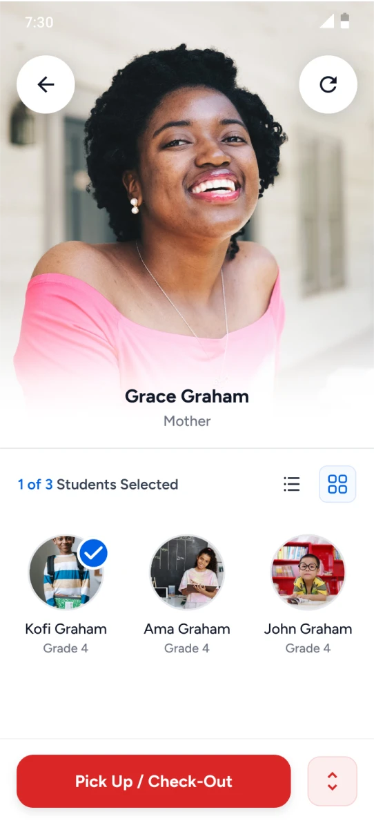
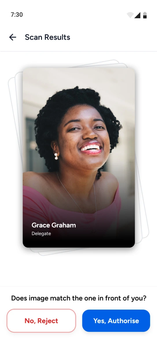
Authorize Pick Up
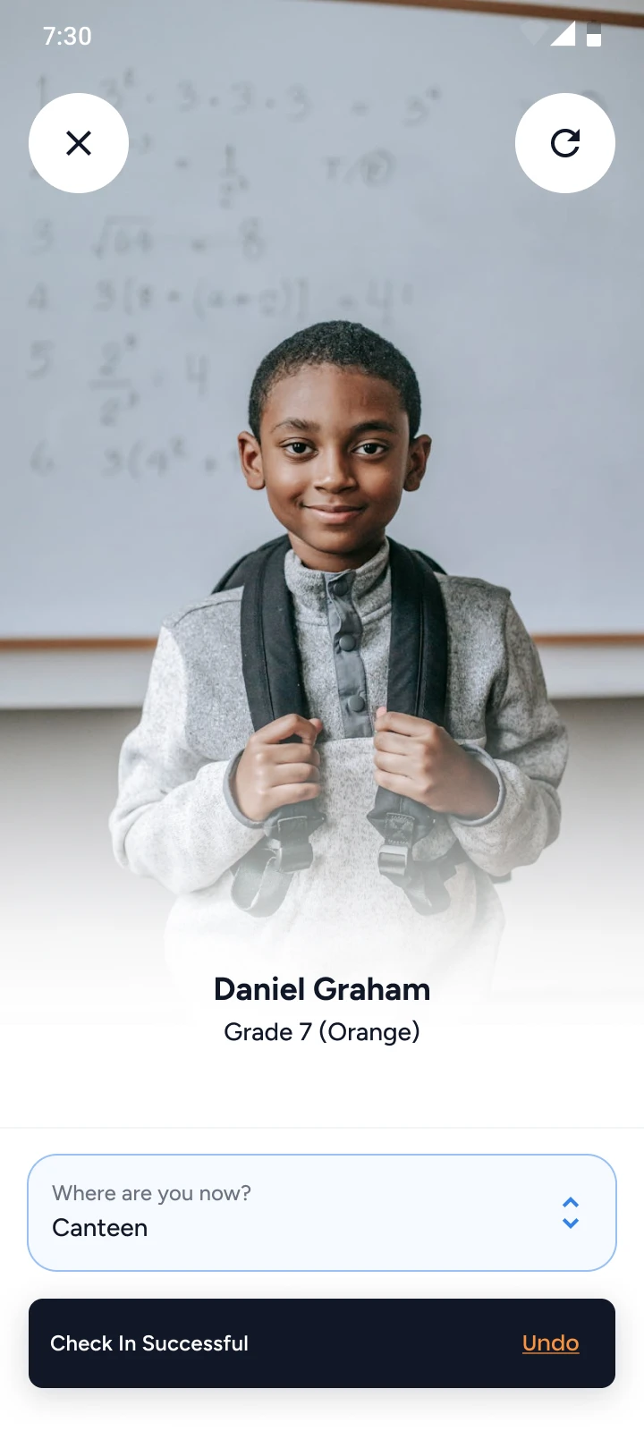
- Made the pickup person easily identifiable with a larger picture and bold name.
- Clearly showed assigned students and students selected to be picked up.
- Added student grid & list view options with a summary count.
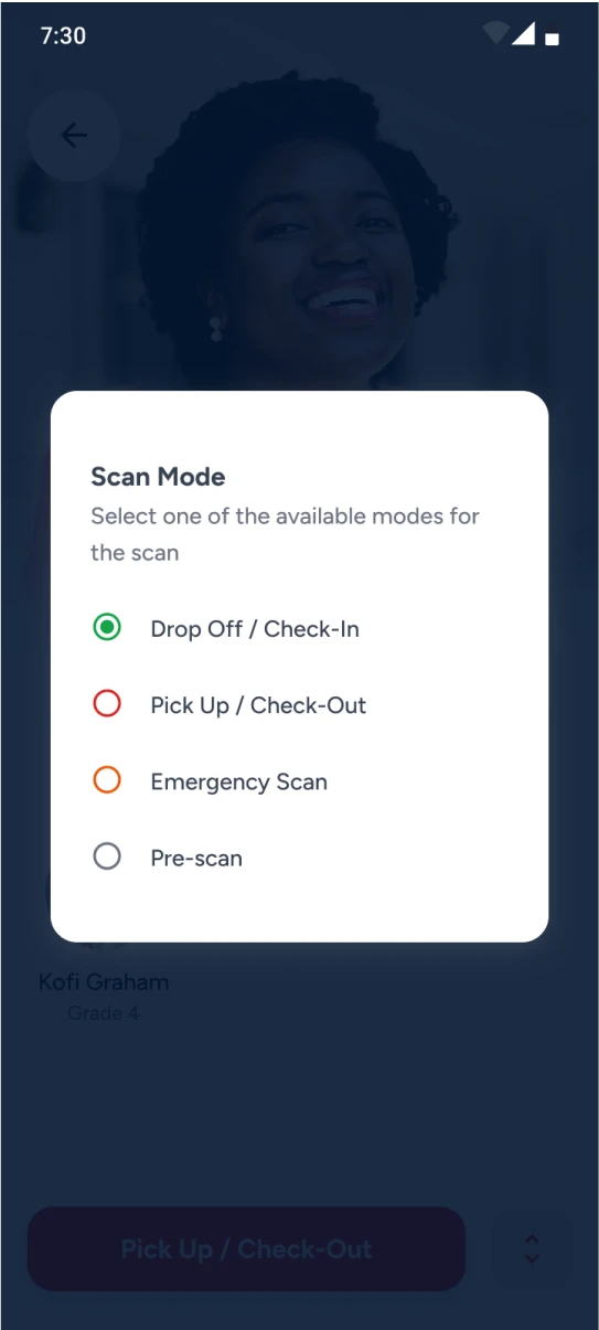
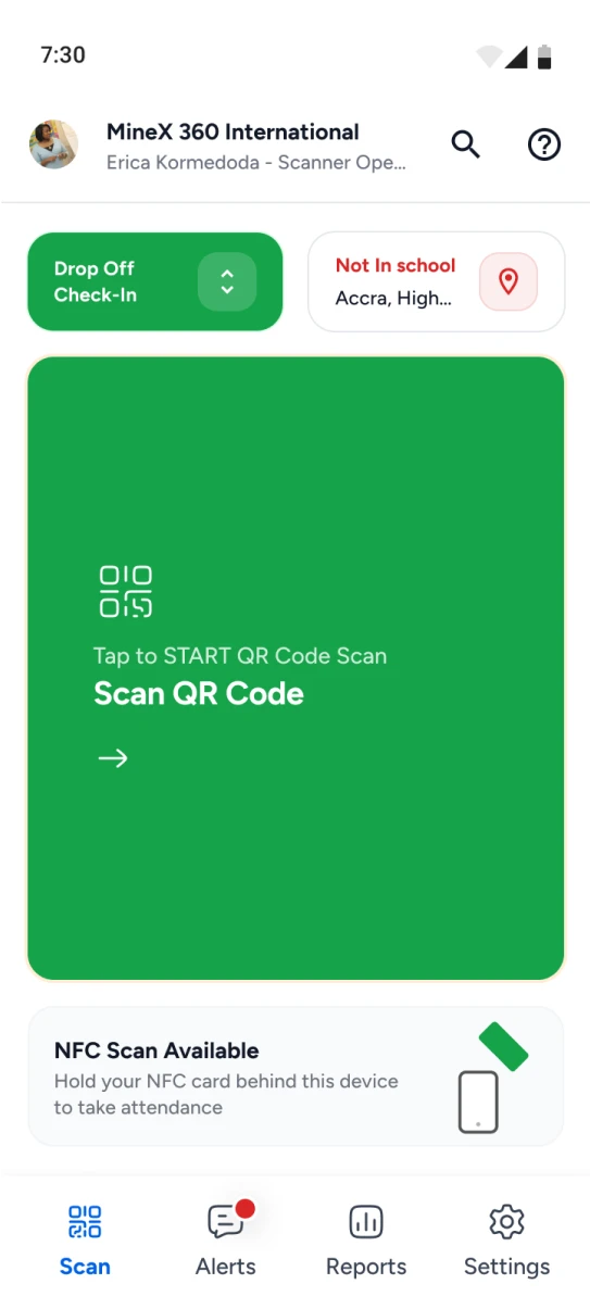
- Allowed scanner mode switch during attendance confirmation.
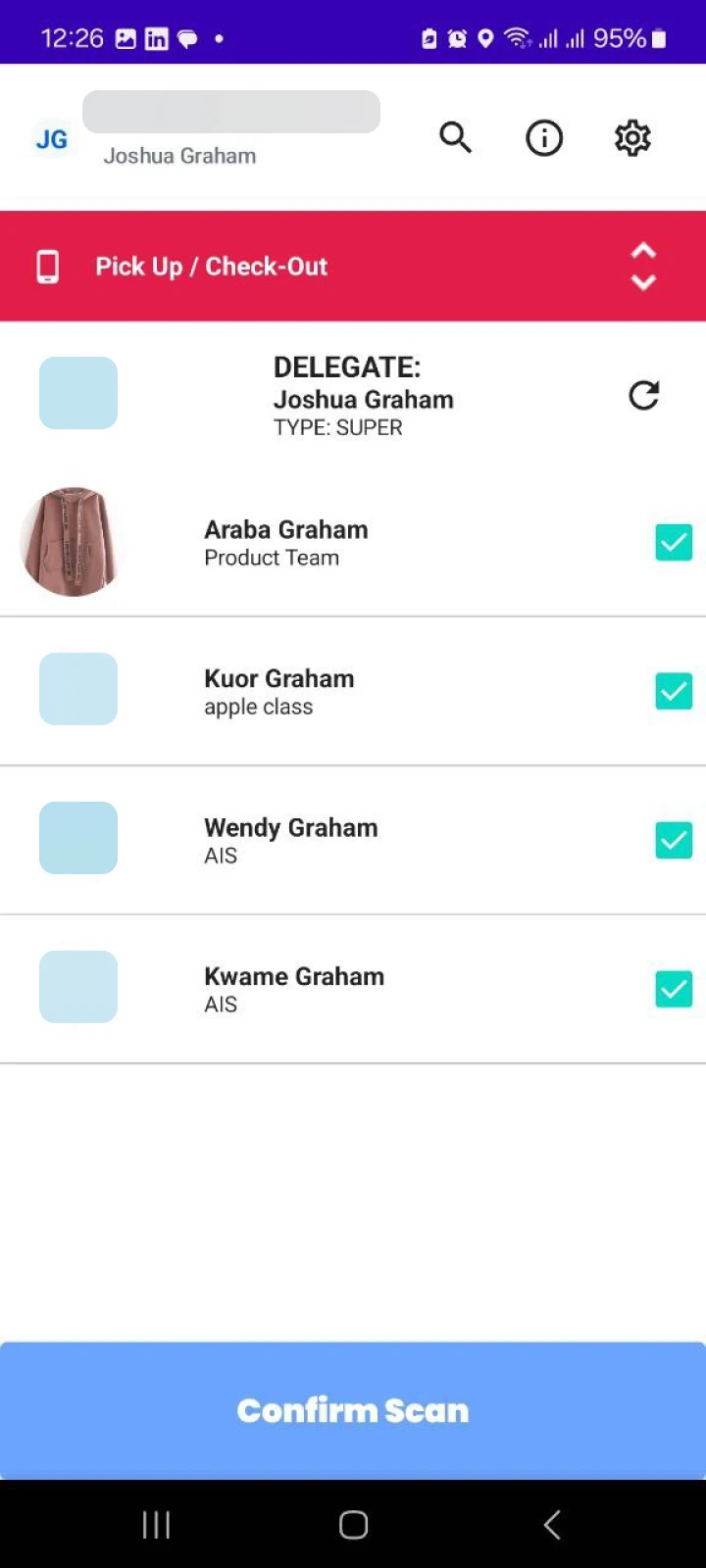

Updates Based On Usability Testing Feedback
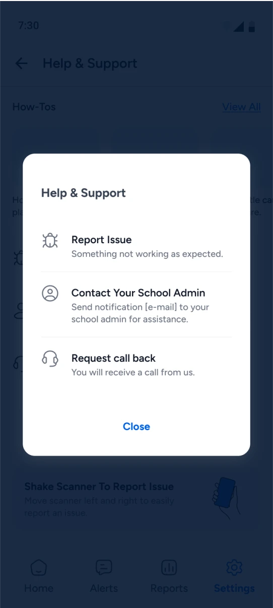
Feedback was gathered from 5 schools and 14 users to validate the effectiveness of the redesign
